
We all have a favourite colour. As children we are asked what our favourite colour is.
In some ways we feel like this may define us as people, but what do each of them mean?
When decorating our homes, we tend to gravitate to certain hues & shades to feel comfortable & relaxed. But we can’t help but wonder… is there a better colour scheme for me?
Let’s explore what psychology each main colour has. Each colour tends to have good & bad sides, which makes our love for colour quite interesting!
RED
POSITIVES – It’s the shortest wavelength in the spectrum so it demands attention & is the first to be seen. This is why they use it for Stop Signs, Don’t Walk & Warning Labels. It stands for Love, Passion, Affection, Life, Energy, Strength. Red is the ‘go get em’ colour, dress in red & you are vibrant, strong & confident. Red stands for luck & prosperity in China & India.
NEGATIVES – Anger, Aggression, Rage, Violence, Blood, War, Terror, Financial Failure (being in the red).
It is known to physically raise blood pressure & increase heart rate. It can also induce the fight or flight mechanism. It increases your metabolism, making you feel like you can eat more. Best not in the kitchen if you want to lose weight.
It is a very energetic colour, while being warm. So it is best to keep it in small doses if you have hyperactive children or a heart problem. As it is very attention grabbing it can dominate a room quickly.
ORANGE
Orange is a mixture colour which usually pulls from the energy of red & the fun of yellow. However it does have some specific feeling of it’s own.
POSITIVES – Orange is warm, comfortable passionate, sensual, fun & cheerful. It is motivating, enthusiastic, & attention grabbing. It is a balancing colour & can still stimulate the appetite like red.
NEGATIVES – Frustration, superficial, insincere, lack of maturity or intellectual values, over-bearing, self-indulgent & rude.
That all depends on the shade of orange. Orange is a colour which is fleeting in design, & does gravitate to eras, such as the 1970’s retro. It is an edible colour, so great in Kitchens.
YELLOW
POSITIVES – Happiness, life, warmth, vitality. It signifies communication, enlightenment & cheerfulness. It is joy & optimism, sunshine & friendliness
NEGATIVES – Irrationality, jealousy, anxiety, depression, fear, deception & cowardice. People who love yellow can be emotionally fragile & anxious.
It can give increased mental activity – which is great for clear thought at work – but in overload, hurts. There was a study done a while ago, putting people in a room entirely of bright yellow – & they snapped to the point of self harm.
Again for Interiors, Yellow should be used sparingly. It is tied to the country kitchens of the 90’s, & recently in modern design when teamed with grey. Also hard to read when against white!
GREEN
POSITIVES – Derived from nature, promotes harmony, relaxation, balance, restfulness & peace. It tends to give you a clearer sense between right & wrong & is logical. It is a sign of growth in both nature & income or wealth. It is the colour of freshness & life. And green means GO.
NEGATIVES – Depression, dullness & over-possession.
Overall the psychology of green is particularly positive, but green can be quite a depressing colour for a home. The right shades need to be used so that it doesn’t appear dull & old.
You tend to see green run throughout the ages with different variations. Mint green in the 50’s, lime in the 70’s, teal or jade are current, with forest green coming back in at times.
BLUE
POSITIVES – Loyalty, trust, dependability, reliable & responsible. (Probably why many businesses & health fields use blue). It is calm, relaxing, soothing & is one of the most liked colours in the world. Strong blues give clear thought & lighter blues give mental focus. It improves productivity.
NEGATIVES – It can be seen as distant, cold, uncaring, or unfriendly when used in larger quantities.
Physically, blue tends to relax & de-stress people, unlike red which heightens the heart rate. It is not an edible colour so not ideal for the kitchen or crockery. It’s ties to water make it good for bathrooms or laundry’s.
PURPLE
POSITIVES – Commonly seen as a spiritual colour. Combining the energy or red & the stability of blue. It is known for imagination, magic, mystery, courage, loyalty, luxury & for the wealthy. This is due to the purple pigments being more costly back in ancient times.
NEGATIVES – Introspection, distraction, suppression. When overloaded it can look cheap & scream decadence.
Vibrant purples do scream, so they need to be used carefully in large amounts. Lavender tones are closer related to neutral browns or blues with the feeling of relaxation.
PINK
POSITIVES – Compassion, tenderness, romance & unconditional love. It is caring, nurturing, soft & feminine. It is sensitive & is a sign of hope. The nurturing & soothing nature of pinks are used in prison to calm inmates.
NEGATIVES – Lack of power, immaturity, physical weakness, inhibition & emotionally stunted.
Large quantities of pink can look overdone & aged. Bright or vibrant pinks can be seen as troubled, unsteady & boisterous (like a teenage girl). These need to be used in smaller quantities.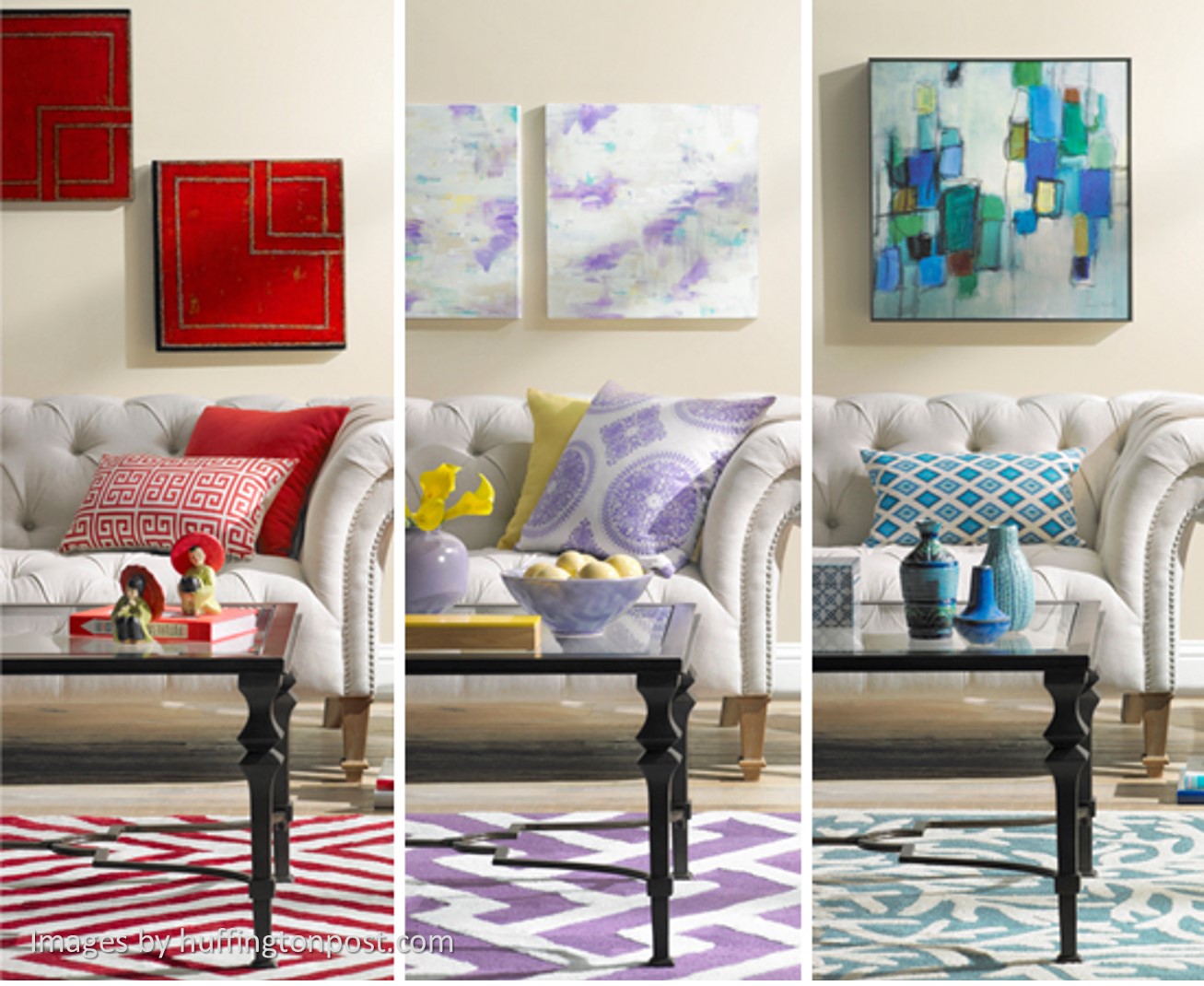
BROWN
POSITIVES – Nature based & is in most designs due to timber. It is a colour of structure, security, protection & constant support (like your morning coffee!) It symbolises warmth & can be sophisticated.
NEGATIVES – It is a safe colour, so it can seem boring, dull & reserved. Lacks humour, personality & can be heavy.
Brown tones go with almost every colour, however you need to choose the right undertone for your palette. Grey based browns tend to show sophistication, while spicy & warm tones bring warmth & a rustic feel.
GREY
POSITIVES – Grey can enhance creativity, unobtrusive, neutral & stylish. It can look sophisticated & sleek. It is also associated with steel, making it perfect for styles like Industrial.
NEGATIVES – Dull, cold, lack confidence, lack personality, is depressive, suppressive & can cause fear.
Grey is the colour of the future & technology. That may be the reason it is popular now in our progressively technological world. And possibly why it was in vogue in the 1980’s as well with their technological boom.
It is more of a city colour, due to all their concrete buildings, whereas country areas have more brown tones. As a neutral it matches almost all colours, making it a great base colour. It can be off white, or charcoal, which helps with toning down these intense colours.
BLACK
POSITIVES – Timeless, glamorous, sophistication & style. It exudes elegance, substance & class. It promotes control, protectiveness, seriousness & contrast. Black is timeless & powerful, A Black Tie event is a high class event. Black is used for Business Men/Women, Priests (protectiveness), and is slimming. To be In The Black for business is to be making money & black can be sleek & stylish.
NEGATIVES – Mystery, darkness, evilness, death, depression, reclusiveness, negativity & sadness. It is the colour of the Grim Reaper, a black hole of despair, the black dog of depression.
In homes, usually use it sparingly. Black is heavy & can easily dominate. Usually charcoals are a safer bet. A builder once told me that there will be a little bit of black & white in every design – & he’s been pretty spot on.
WHITE
POSITIVES – Purity, innocence & peace. It is the colour of new beginnings, such as a white canvas to start with, & gives fresh ideas. White is balanced & simple. It is a great colour for cleanliness & hygienic spaces. White is great for reflecting light, it gives a feeling of openness & air & is a great base colour for others to be seen by. White is great for those hygienic spaces like Kitchens & bathrooms. It also makes these typically smaller rooms look larger.
NEGATIVES – Isolation, loneliness & emptiness. It looks sterile, cold, unfriendly, elitist & can be abrasive if too stark.
When using an off-white for your walls in a house, crisp it up with stark white trims to highlight the colour of the walls. And once again – hard to read!


Colour Psychology is used fiercely in Marketing. It’s all about ways to sell to you, without you being aware. If you don’t believe me… just take a trip to a shopping centre or look at a few logos, like take away foods in red & yellow.
Colour Psychology for home
The same concept can be used in your home to say what you want with your interiors. Do you want a serene space? A light & fresh interior, or a moody, intimate feeling. Once you know what feeling you would like to promote, you can work a colour palette from there.
It is a great idea to research what style you are after. This could be Industrial, The Hamptons, Classical, Country, Post-Modern, Art Deco… and the list goes on. Once you have an idea of what styles or eras you like, you will realise that there is a colour palette for that style. For example, Scandinavian is based in a light colour palette or whites & off-whites, mixed with blonde timbers & the feeling of space. This makes colour matching much easier!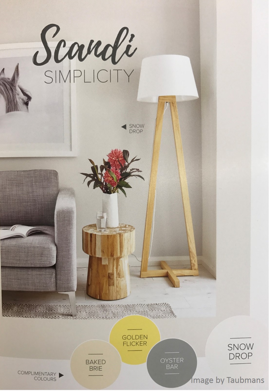
Also keep in mind that colour is not only paint. Colour is brought in with décor, furniture & functional life items like chopping boards or tooth brush holders. Every item in a room has the potential to agree or disagree with your colour palette. So make sure you scrutinise each piece. This doesn’t mean you have to replace it if it doesn’t fit, maybe just repurpose or find a way to highlight it in your scheme.
Have fun with colour!
It is the easiest & most dominate alteration that you can make to a home, with the best part being… you can easily replace or fix a colour if it is not right.
So… what is YOUR favourite colour??
References used to formulate this colour psychology blog – Resene Colour Choices Chart, https://coschedule.com/blog/color-psychology-marketing/, https://www.colorpsychology.org/green
Keep on reading with these Interior Design Blog Posts –
The Hamptons Style – https://www.mystereedesigns.com.au/the-hamptons-style/
Lighting your Home – https://www.mystereedesigns.com.au/let-there-be-light/
How to get the Most out of your Interior Designer – https://www.mystereedesigns.com.au/5-tips-to-get-the-most-out-of-your-interior-designer/
Budget Kitchen Makeover – https://www.mystereedesigns.com.au/budget-kitchen-makeover/
Decorating Open Plan Living Spaces – https://www.mystereedesigns.com.au/planning-open-plan-living-spaces/
Do you get stuck with colours? Click here for Colour Advice.
You can also find me on my socials for the latest projects –https://www.facebook.com/MystereeDesigns https://www.instagram.com/mysteree_designs/