We’ve all heard the strange & strangely popular paint colour names that stick in your head… Clotted Cream, Hog Bristle & the golden oldie of Mission Brown. But with so many thousands of colours out there on offer, which ones are the most ‘on trend’ for modern homes?
For the answer we’ve got to go grey.
Grey is in.
Personally I think it’s because we’re living in the technological age. Remember those old movies depicting ‘the future’, with everyone all living in grey rooms with tailored grey clothing & stern looks on their faces. Well the future is now, where we can connect to anyone across the world in an instant, & so we’re living in the world of grey. But before you get upset by the uncaring nature grey can have, the new palette is soft, warm & inviting. Many people love the freshness of a clean grey. This is one in between black & white, sounds simple…right?
Each brand has its own favoured greys, for Dulux it is Grey Pebble & Beige Royal, for Taubmans it is Satellite & Amenity, & Haymes has Greyology 1-7 depending on your level of depth. But what it all comes down to is the undertones.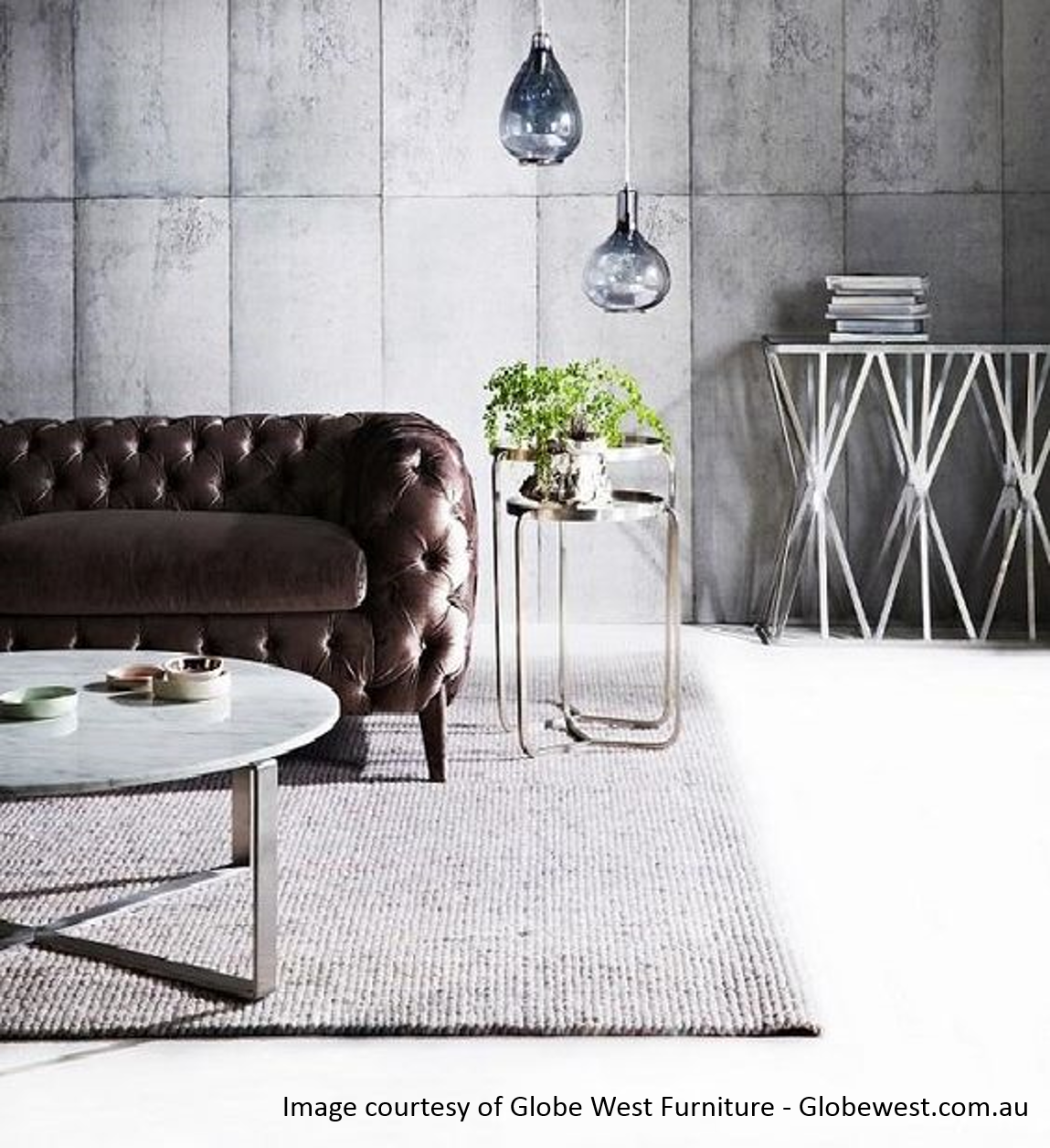
However when you start looking at grey paint colours you will notice that they usually throw a blue, green or brown tone as well as being grey. This is similar to all your black clothing, black just isn’t black enough!
So what undertone of grey do you choose??
When choosing greys for your home, take the time to look at the surrounding hues in your room. Do you have timber flooring? Is the carpet a warm colour? What is the splashback colour? Interior Design is working all of these in together to a harmonious theme, & that is what you need to do.
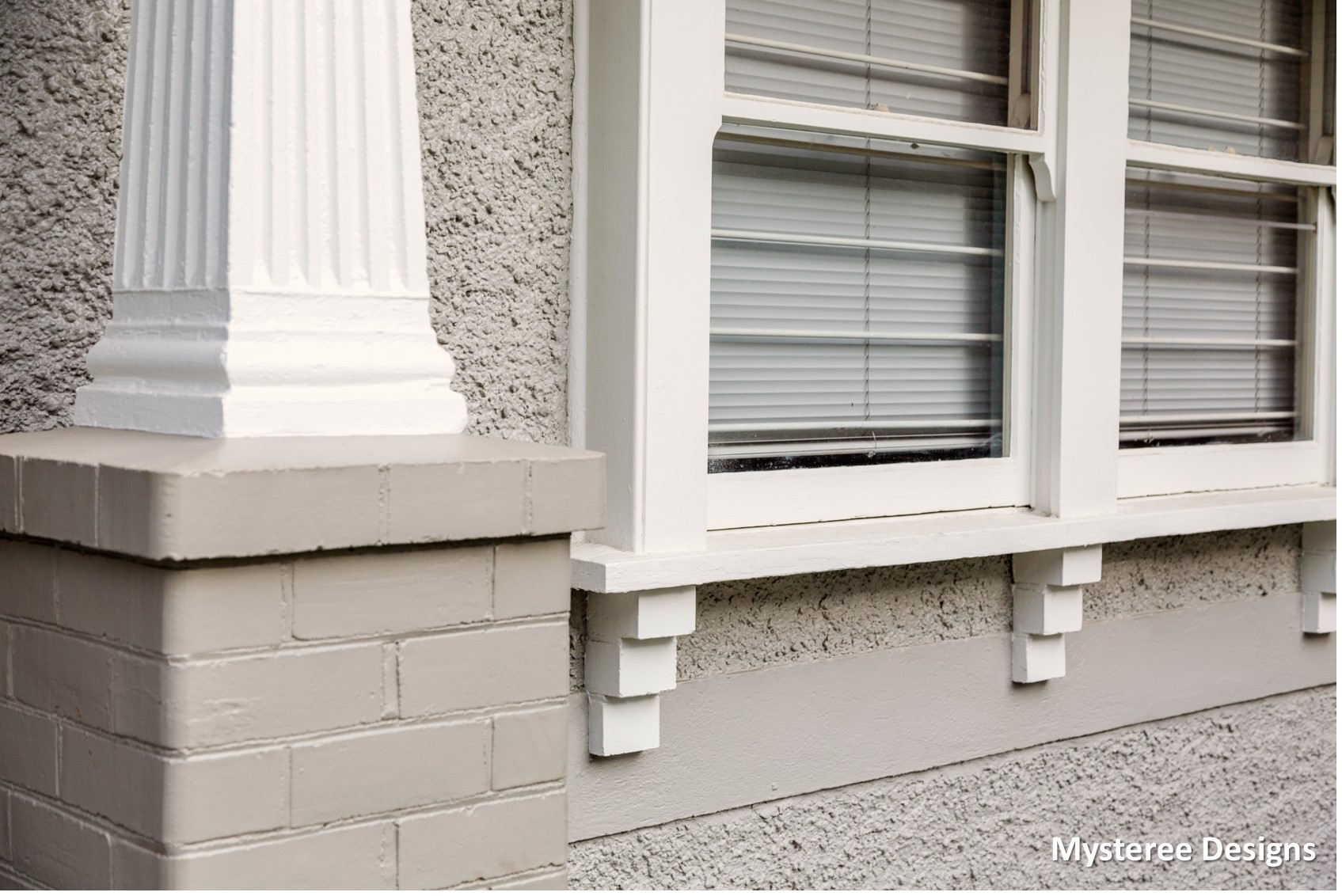
If there is timber in the rooms, then a grey-brown is better (greige – otherwise known as grey-beige). If you have slate flooring, then perhaps a green tinge is desired. But if you are decorating a room that is predominately black & white, then a clean grey would work well. It is all about styling with what you have to make sure if all flows together.
How do I know which grey is which?
Place the paint cards together. You will usually see which ones have coloured undertones. But wait!! Don’t just discount them straight away. You really have to see them against all your finishes at home to see if they blend with your colour scheme. It is amazing how different they look at home than in the paint store.
Grey is best if matched with a white trim colour. This highlights the shade chosen & makes it appear fresher. This is also quite a modern touch to add a white skirting & architrave. If you want a stark white, then the whiteness of untinted paint would suffice, but for a little bit of softness Dulux’s Natural White or Lexicon are great clean options.
Grey is also classed as a ‘neutral’ tone which means that you can add almost any décor colour & make it pop. It can also be a great base colour for Scandinavian, Hamptons, Industrial, Vintage, Modern & Classical styles.
That’s just some of the many, many reasons we’re all loving grey.
Get all the information you need with these free Interior Design posts –
Colour Psychology in your Home – https://www.mystereedesigns.com.au/colour-psychology/
Decorating Open Plan Living Spaces – https://www.mystereedesigns.com.au/planning-open-plan-living-spaces/
The Hamptons Style – https://www.mystereedesigns.com.au/the-hamptons-style/
Budget Kitchen Makeover – https://www.mystereedesigns.com.au/budget-kitchen-makeover/
Proportion Design Principles – https://www.mystereedesigns.com.au/design-principles-my-favourite-proportion/
Lighting your Home – https://www.mystereedesigns.com.au/let-there-be-light/
You can also find me on my socials for the latest projects –https://www.facebook.com/MystereeDesigns https://www.instagram.com/mysteree_designs/